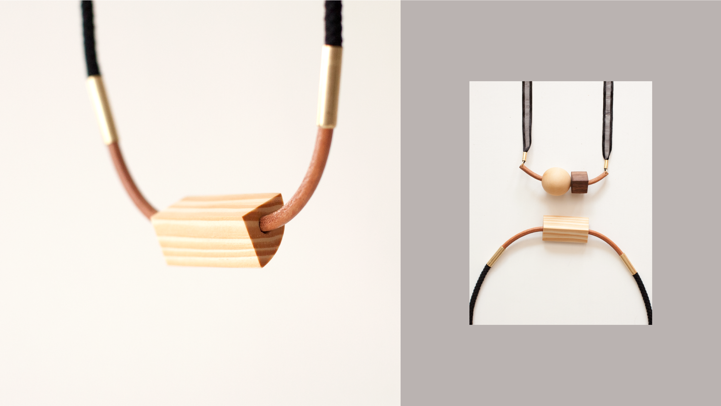
How to make a jewelry brand feel modern and natural?
Arc+Ray jewelry collection is inspired by Modern art and Mid-century design. It is handmade using various natural materials. The name Arc+Ray was chosen for its reference to geometry. Arc indicates the curve line, and Ray means the straight line, which is the foundation of any shape.
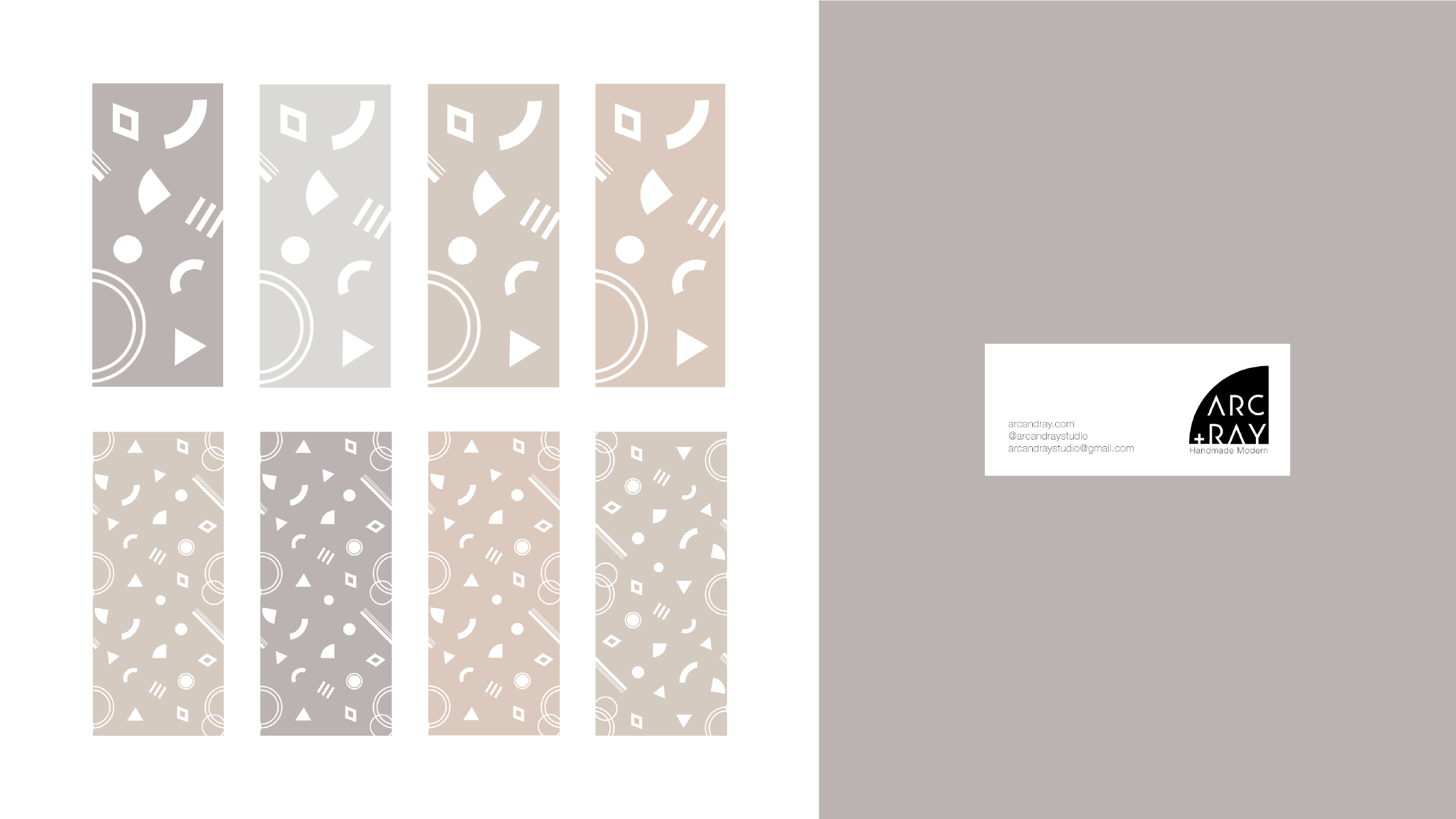
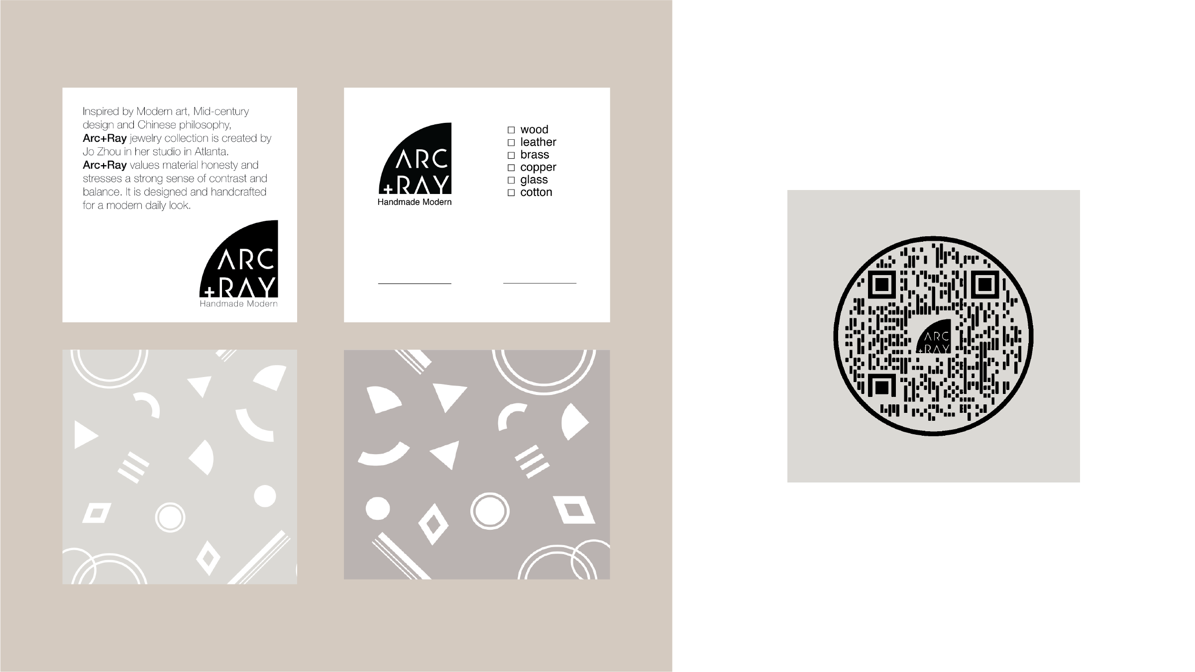
I designed a visual identity system for Arc+Ray that feels modern and connects with the collection’s diverse nature and use of materials. The logotype is simplified to basic geometric lines, embedded in a quadrant shape, which is a signature shape from Arc+Ray’s work. For color, I created a muted warm Morandi color palette to build a soothing natural tone.
Arc+Ray Branding
Keywords: modern, geometric, natural
What I did: brand strategy, logo design, visual identity, print design, photography, website design, line sheet design, booth design, environmental graphics, and other collaterals.
visit arcandray.com and Instagram @arcandraystudio